New York City redesigns the international symbol of access
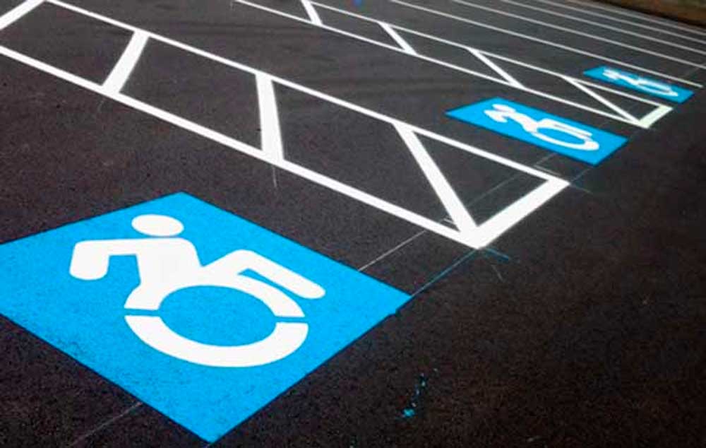
For some years now, the ubiquitous “handicapped” symbol — a blue and white logo of a person leaning back in a wheelchair known as the international symbol of access — has come under fire from disability activists who feel the logo paints disabled people as passive. Now, a new logo might be gaining some traction. New York City has agreed to start using a more active logo designed by activists at Gordon College in eastern Massachusetts; current plans call for NYC to start displaying the logo all over the city starting this summer. “It’s such a forward-moving thing,” said Victor Calise, commissioner of the New York mayor’s Office for People With Disabilities.
The movement initially started when the group behind the new logo started placing its stickers over old handicapped signs around the Gordon College campus, and eventually stickers of the final design were distributed throughout nearby Boston. While getting the logo around has largely been a “stealth operation” up to this point, visibility from the biggest city in the country should help it gain more traction. “That will make a splash,” said Wayne Sailor, co-founder of disabled advocacy groupTASH and professor of special education at the University of Kansas. “I predict it will be a real trendsetter.”
The Icon Graphic Elements
![]() 1 – Head Position
1 – Head Position
Head is forward to indicate the forward motion of the person through space. Here the person is the “driver” or decision maker about her mobility.
2 – Arm Angle
Arm is pointing backward to suggest the dynamic mobility of a chair user, regardless of whether or not she uses her arms. Depicting the body in motion represents the symbolically active status of navigating the world.
3 – Wheel Cutouts
By including white angled knockouts the symbol presents the wheel as being in motion. These knockouts also work for creating stencils used in spray paint application of the icon. Having just one version of the logo keeps things more consistent and allows viewers to more clearly understand intended message.
4 – Limb Rendition
The human depiction in this icon is consistent with other body representations found in the ISO 7001 – DOT Pictograms. Using a different portrayal of the human body would clash with these established and widely used icons and could lead to confusion.
5 – Leg Position
The leg has been moved forward to allow for more space between it and the wheel which allows for better readability and cleaner application of icon as a stencil.
Is this ADA Compliant?
The short answer is yes. Federal and state officials have determined that slight variations on the historical International Symbol of Accessibility are generally permissible as long as the symbol clearly displays a wheelchair and signifies accessibility.
Forward thinking companies such as The TJX Companies, have utilized another progressive symbol by the graphic designer Brendan Murphy. We are grateful that companies like Talbots have embraced the Accessible Icon as well.
Different states have different regulations concerning the size, color, and placement of the symbol. For instance, in Massachusetts, accessible parking spots must be identified by a vertical parking sign, but symbols on the ground are not required. We recommend that you review state and local regulations before painting the Accessible Icon on parking spots or placing the sticker on signs.
Although some states require that the background be painted in “Handicapped” Blue – which we will call Accessible Blue from this point forward! – and the figure be painted in white striping paint. Other states such as Massachusetts do not mandate a color scheme. For this reason, some of the logos we’ve painted have figures that are rendered in striping paint red on a safety yellow background – which we think might be superior for people with limited vision – while others have been rendered the figure in striping paint white over the Accessible Blue background. Again, we recommend that you review state and local regulations before painting the Accessible Icon.
Source: The Verge
Compartilhe
Use os ícones flutuantes na borda lateral esquerda desta página
Siga-nos!
Envolva-se em nosso conteúdo, seus comentários são bem-vindos!
6 Comentários
Enviar um comentário
Você precisa fazer o login para publicar um comentário.
Artigos relacionados
Acessibilidade no transporte aéreo. Atualização das regras.
Acessibilidade no transporte aéreo. Revisão da Resolução nº 280/2013 da ANAC através de consulta e audiência pública.
Inclusão no filme Wicked. Atriz cadeirante chama a atenção.
Inclusão no filme Wicked. Marissa Bode é uma atriz com deficiência na vida real, e sua deficiência não foi um impedimento para a atuação.
Diretrizes da ANPTUR para o Turismo Brasileiro
Diretrizes da ANPTUR para o Turismo Brasileiro. Acessibilidade é um dos capítulos desse importante guia orientador para o turismo.


ルイヴィトン 中古 http://cg-design.nl/avatar/ture-louis-vuitton47.html
ルイヴィトン 長財布 中古 http://bunkerinsure.se/check/nice-louis-vuitton27.html
Sr. Shimosakai, vocês sabem notícias de algum cadeirante que devido a uma escara desenvolveu ossiomielite e foi curado? e cura par escara existe?
Date: Tue, 30 Jul 2013 15:01:37 +0000 To: sol.profa@hotmail.com
Me encontro nessa situação, tive escara e osteomielite, porém não foi totalmente curada. Não conheço quem tenha passado por isso e esteja curado. E as escaras são curadas, só que demoram, é um tratamento de recuperação longo e que necessita de disciplina
Com certeza o novo simbolo representa melhor o cadeirante dentro da sociedade.
é importante haver mudanças, significa a vontade de melhorar